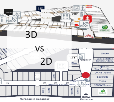
| | 3D floor plans | Semi-3D floor plans | 2D floor plans |
| Overview of the building |
- 3D floor plans give a good overview of your location.
- With 3D users see the map the way they see the building in real life.
- It is possible to show the details, that people use for orientation inside building, for example escalators, pools, statues, tables, benches, trees etc.
- Showing walls give a better understanding of where you are and it is easier to link the map with a real building.
- It is easy to understand which floors have atriums and distinguish between things on different plains.
|
- Semi 3D floor plans give also a good overview where you are.
- Semi 3D can be shown only from the one angle, when looking from the other side, they can be are hard to understand.
- Limited possibility to show the walls of the building.
|
- Detailed 2D floor plans don’t give a clear overview, so it is better to use simple floor plans.
- With simple maps the amount of details are limited.
- It is hard for users to understand where they are and linking the map with real building is not that convenient.
- With 2D it is not possible to show the walls of the building.
|
| Usability of wayfinding application |
- 3D floor plans are easy to use. It is always possible to limit the zoom distances and even forbid rotation if needed.
- Pathfinding is simple and 3D gives a good visual overview for navigating from one floor to another.
- It is always possible to use camera view for path visualization.
- Extra dimension enables to add more info.
|
- Semi 3D floor plans are also easy to use, but it is not possible to rotate the maps.
- Pathfinding is more convenient than 2D, as users can see some parts of the walls.
- It is possible to add more info to the maps as 2D, but it is still not possible to add as many info/layers than 3D.
|
- Rotating and moving is not that convenient, especially when looking on the vertical screen.
- It is not convenient to guide visitors to other floors.
- 2D floor plans should be kept simple, as there is limited space for layers and info.
- Simple maps may not provide enough information and visitors may think, that the maps are not useful for them.
|
| Map details and amount of information on the floor plans |
- With 3D there is one more dimension for presenting details and map related data.
- Billboards on the map don’t disturb browsing.
- It is possible to show details for better orientation.
|
- It is possible to add more details than 2D maps, but the space for information is still limited.
|
- Level of details should be kept as simple as possible, otherwise they disturb the understanding of the map.
- Illustrated details cannot be presented in real size and it can be confusing.
|
| Impression and imago of the building |
- 3D floor plans look nice and realistic.
- Visitors have a sense of „controlling the building”, which makes them feel good
- Users understand, that there has been more effort to make the wayfinding for them as good as possible.
|
- Semi 3D looks prettier than plain 2D map.
- Visitors may get disappointed when they try to turn the building, as they expect it to be real 3D.
|
- With too simple 2D maps it is possible, that visitors may avoid using maps not to look foolish.
- Detailed maps confuse visitors and they feel more lost than they were before stepping in front of the wayfinding application.
|
| Displays and future technological possibilities |
- 3D wayfinding can work also with real 3D technologies like holograms, LED-cubes and 3D displays. Unfortunately these technologies are still in prototype phase.
|
- With larger displays it is possible to add more details.
|
- There is no reasonable point of showing more details with larger screen.
|
| Advertising channel and Digital Signage integration |
- More advertisements can be shown on the maps, as the ads don’t hide the map.
- Billboard ads on the maps look cooler and attractive.
|
- Better than 2D but the advertisements still hide the map.
|
- Advertisements disturb the using the wayfinding.
- Less space for advertisements, as they hide the map behind them.
|

